Prep Society
Project Description
Corporate Identity and Branding for an online retailer of “prep” style clothing and accessories club. The brand ideal is to impart a feeling of upscale tradition and exclusivity.
Project Details
Client Prep Society, LLC
Date Mid – 2013
Skills Branding, Identity, Web Design

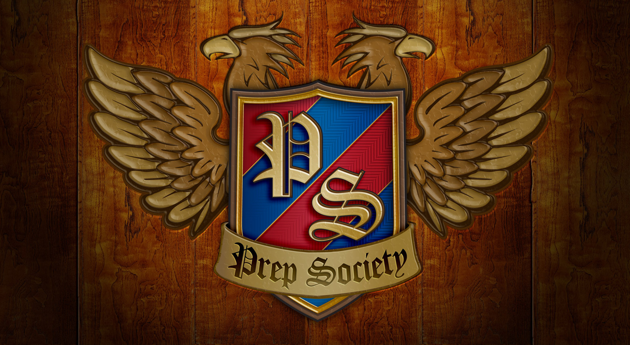
The old-fashioned way
Once again, the design begins as sketches on paper. Hand-drawn elements are digitized and authentic details are added to create a truly elegant and luxurious logo.
Details, details, details.
No detail is overlooked, such as the silken weave of the traditional prep school repp tie, with its colored bars and herringbone pattern. The aged bronze / gold treatment also serves to infer long-standing tradition and American hard-working values. Intense depth and detail enhances the strength of the brand.

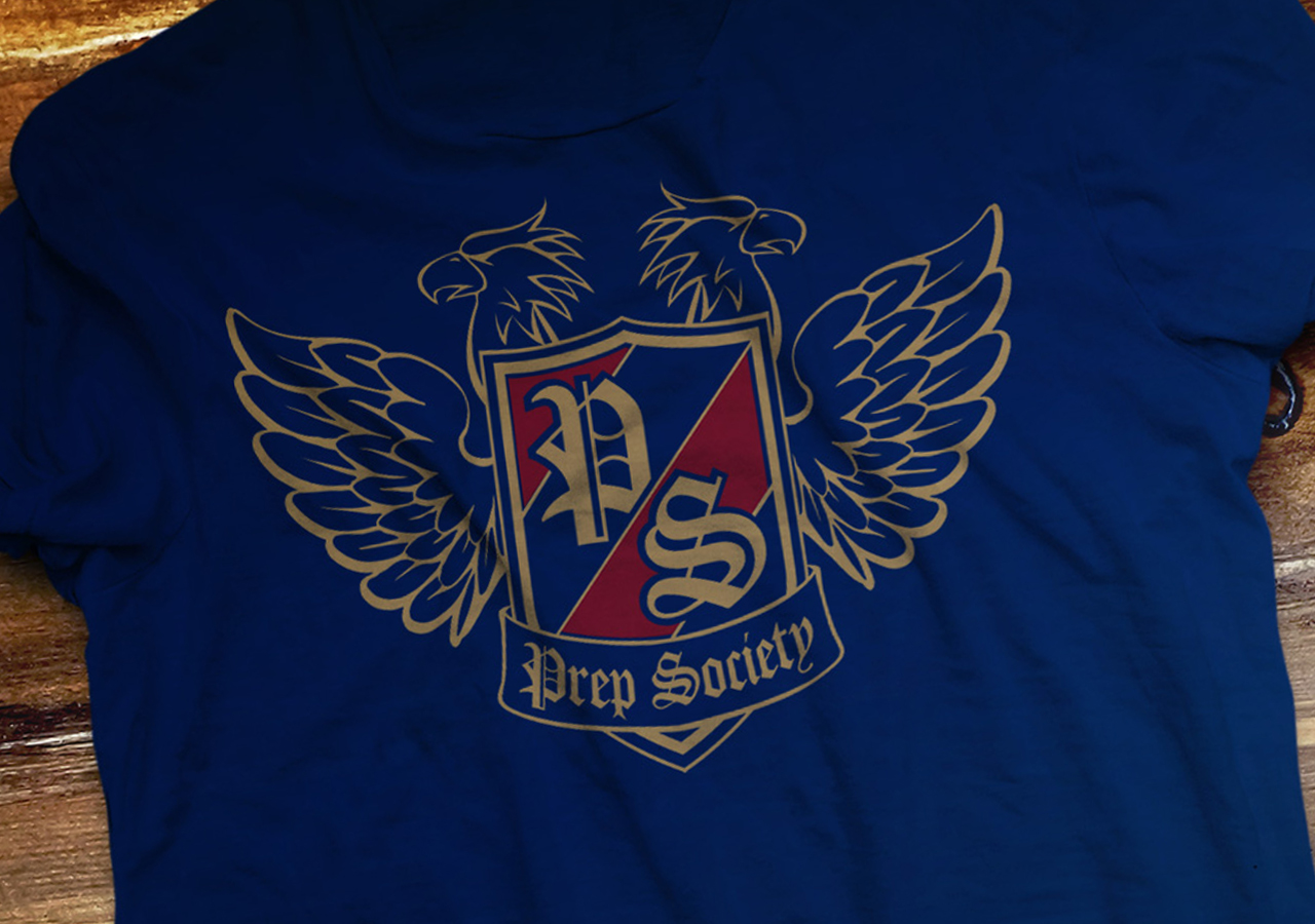
Apparel
A two-color, flat version of the logo was developed for merchandise including apparel. The design was distilled down to two colors, red and gold, and printed on a navy blue shirt, so that silk screening would be cost effective while maintaining brand integrity.
Members Only
A single-page website was developed to tease the opening of the service. Prospective members could sign up to be notified for membership “acceptance” and other notifications, as well as find the brand’s social media channels.